FEATURE: The Inspiration Behind Fleet Feet's Latest RUNCHI Hoodie Designed by Russell Yost
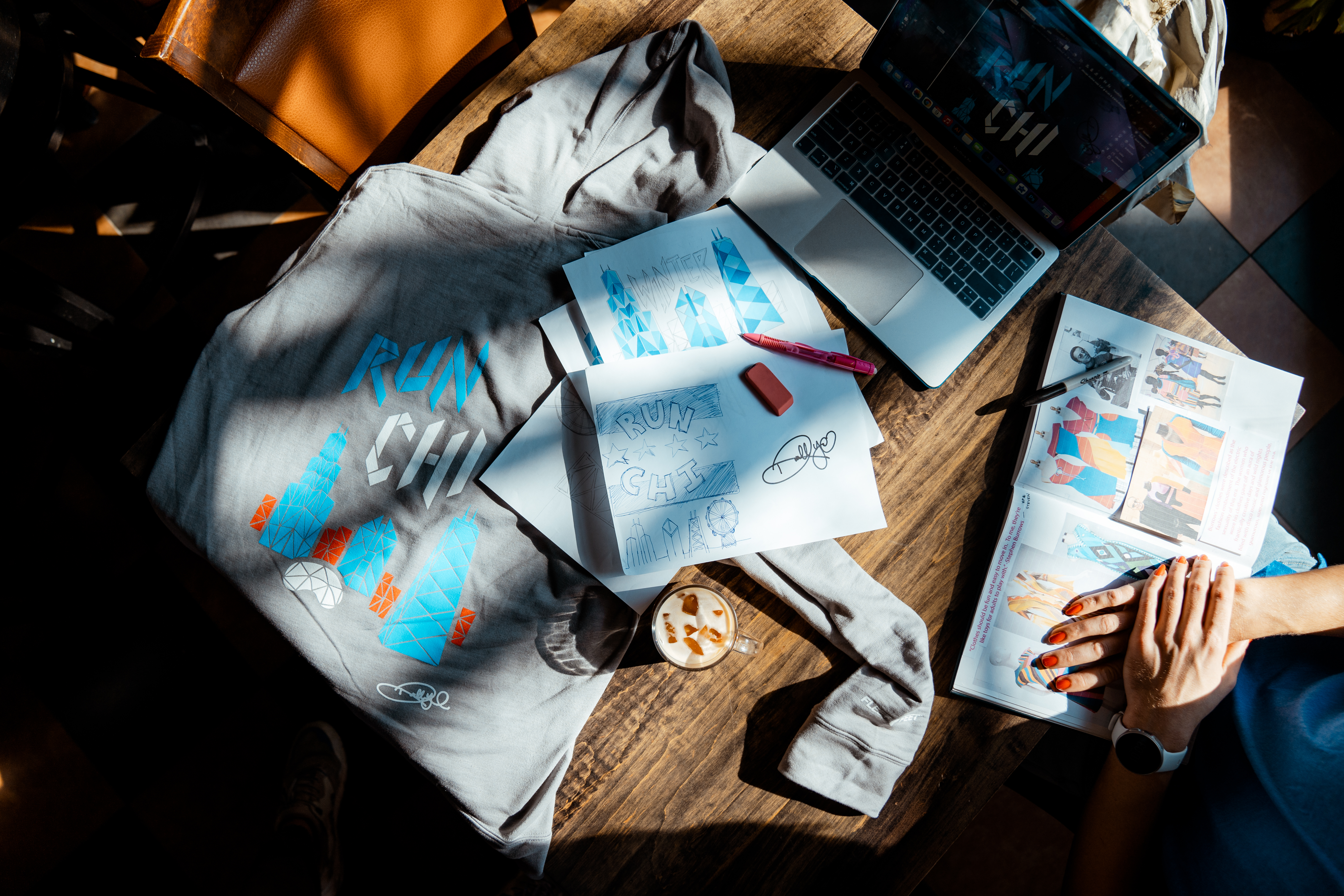
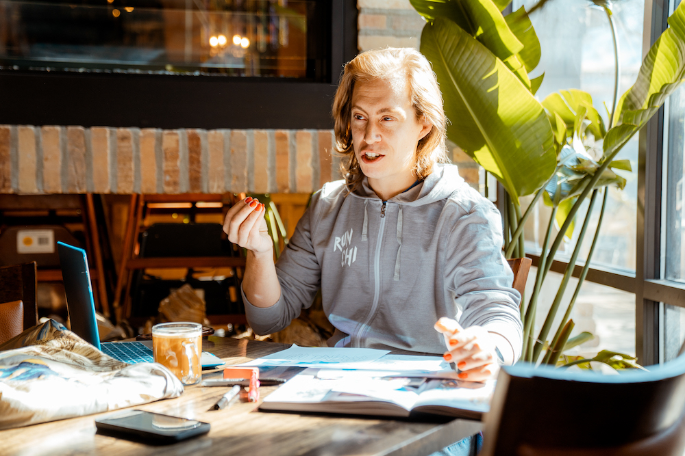
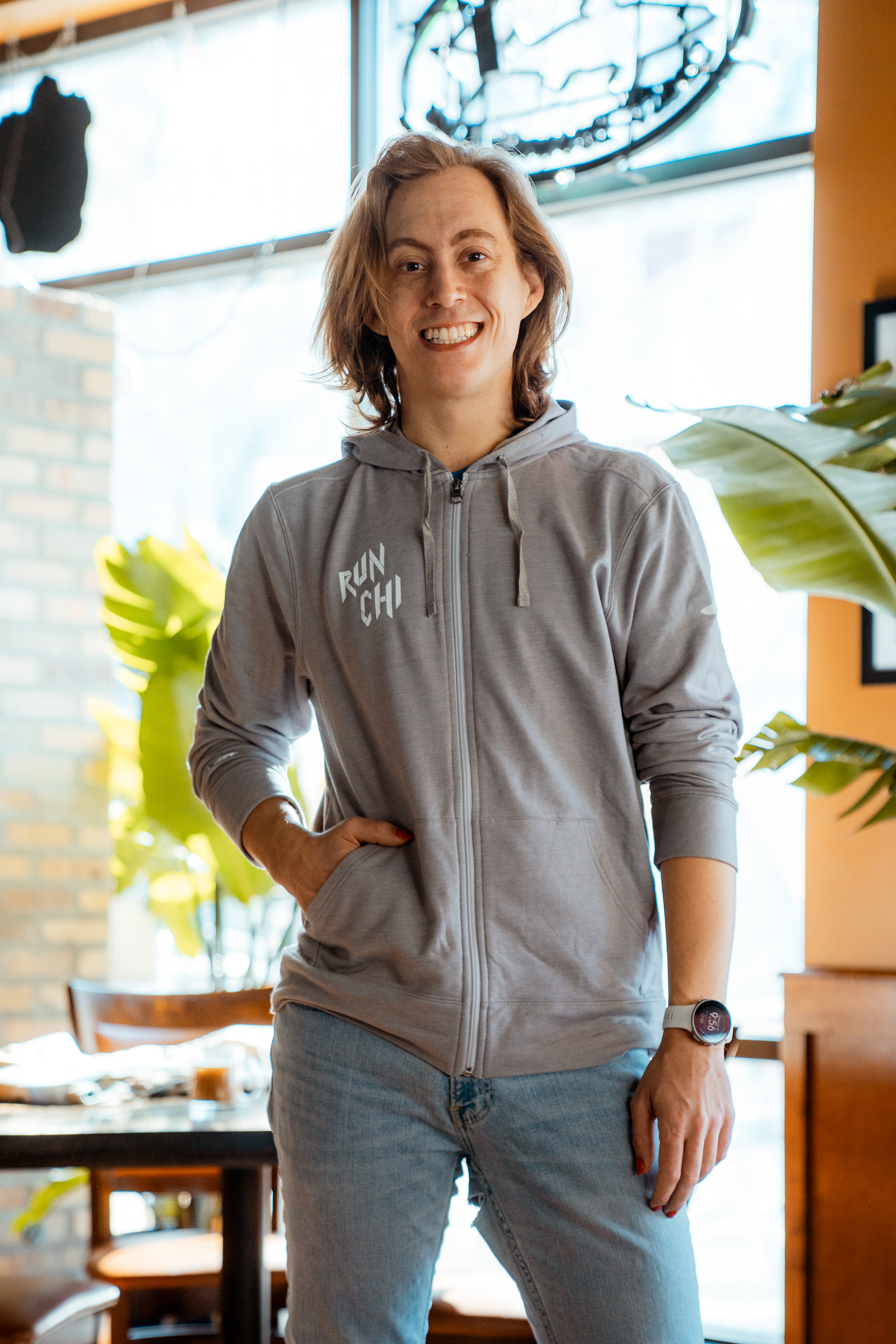
Fleet Feet's latest RUNCHI hoodie is a special one. Printed on a super soft and semi-fitted Brooks Full Zip Hoodie 2.0 the graphic is designed by Fleet Feet Chicago's own store Visual Merchandiser Russell Yost.
By happenchance, we found out that Russell is a talented graphic designer with an expertise in fashion design illustration. Using their experience in patchworking textiles, this illustration leans into that skillset.
We talked to Russell about the inspiration behind the design, their design background, and the tools used to create this limited edition piece from concept to execution.
The Brooks Fleet Feet RUNCHI Full Zip Hoodie 2.0 is available for purchase for $60 here.
What is your background in design?
My mom is an interior designer, so I've always been creative. And I do fashion design illustration and all that kind of goes with it.
Did you go to school for design?
Yep. I have a BFA in Fashion Design from Columbia.

You mention you specialize in patchworking. What does that entail?
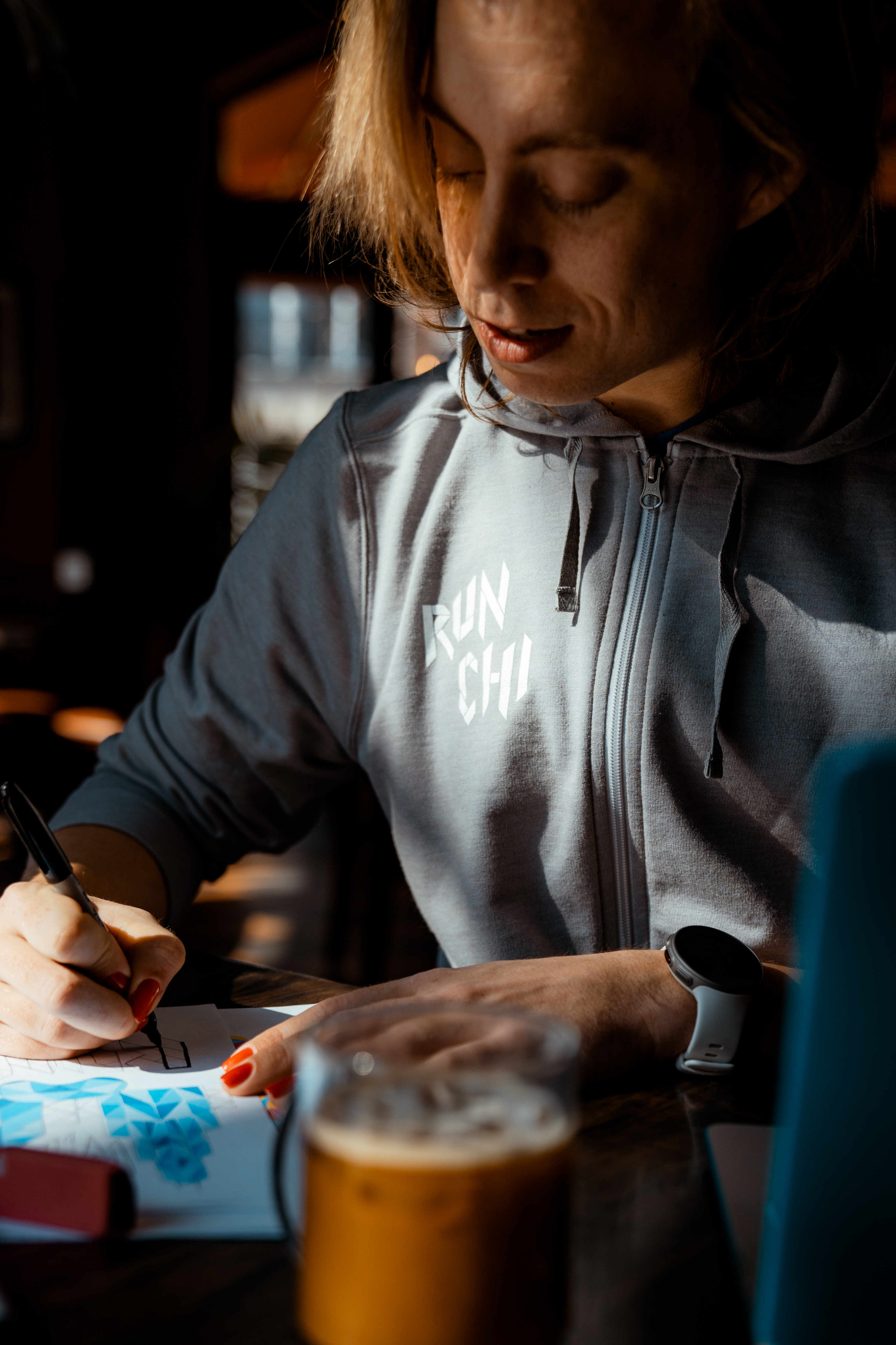
Yeah. I love a lot of color and a lot of texture and I love scraps and using the extra fabric that's left when you do all the cuts. You can't always do a ton of stuff with scraps, but you can patchwork them all together and work with all the textiles and it just kind of becomes really eclectic, almost like a fabric collage. Sometimes when I sketch, I kind of think like that.
Can you share some inspiration behind the design?
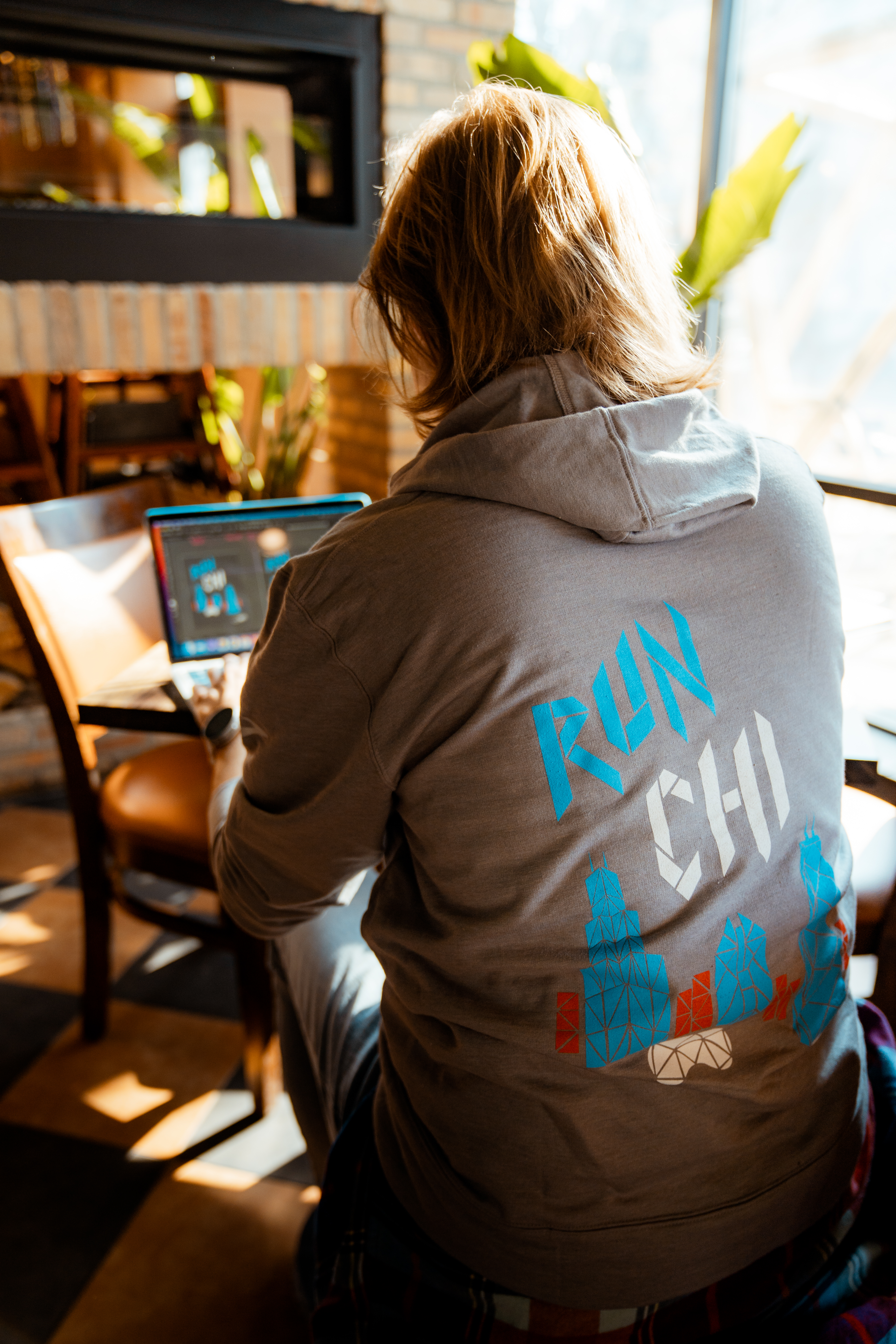
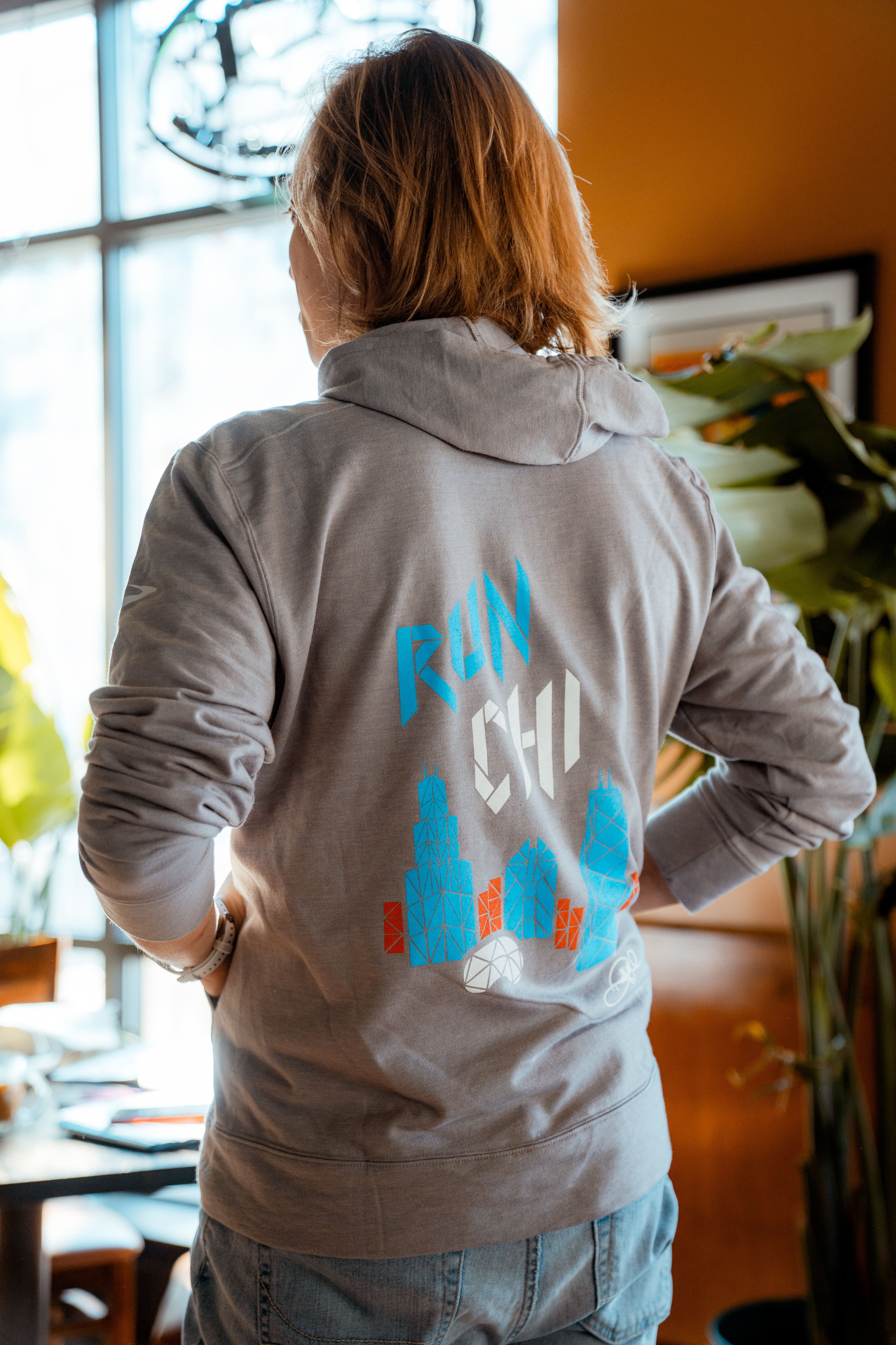
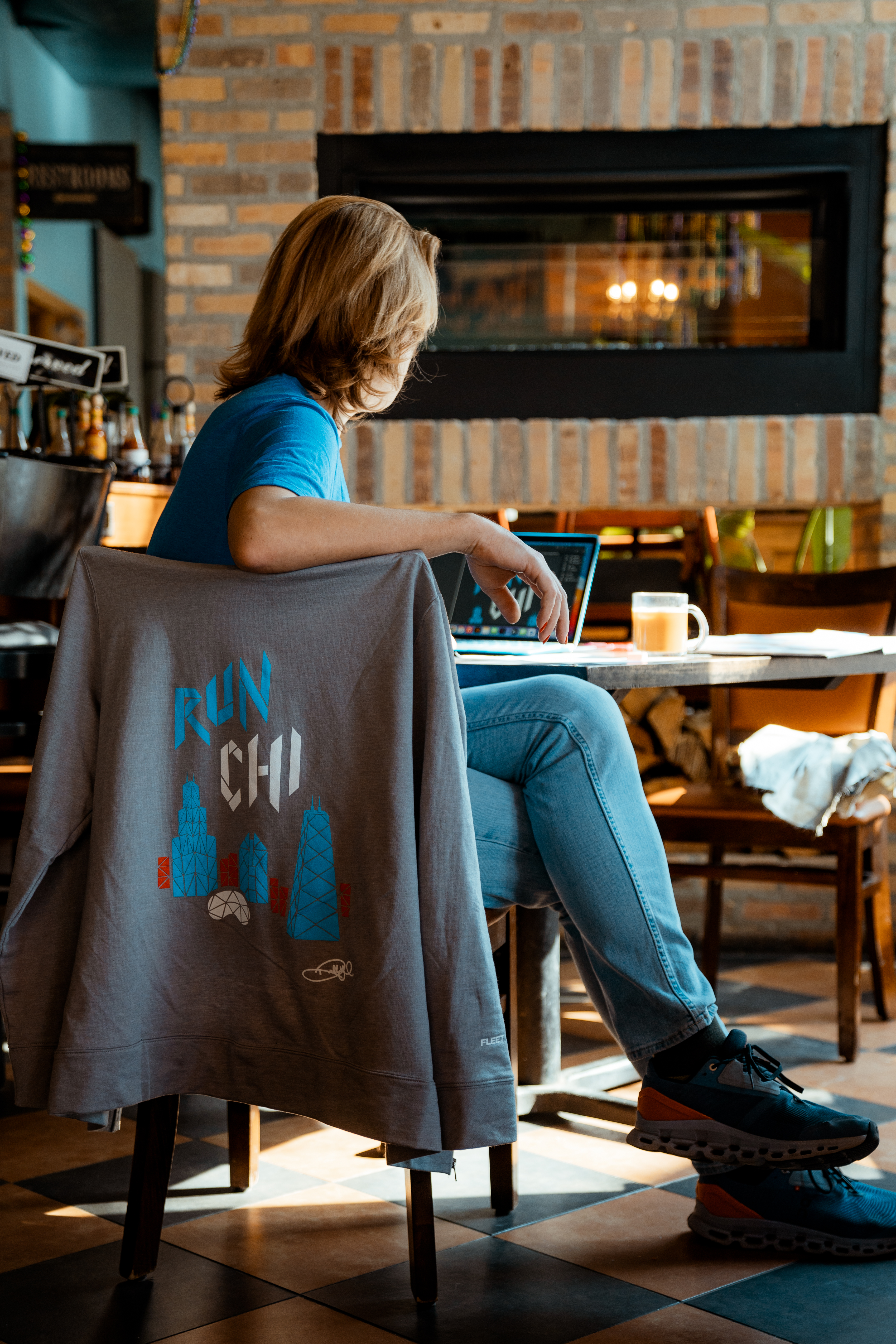
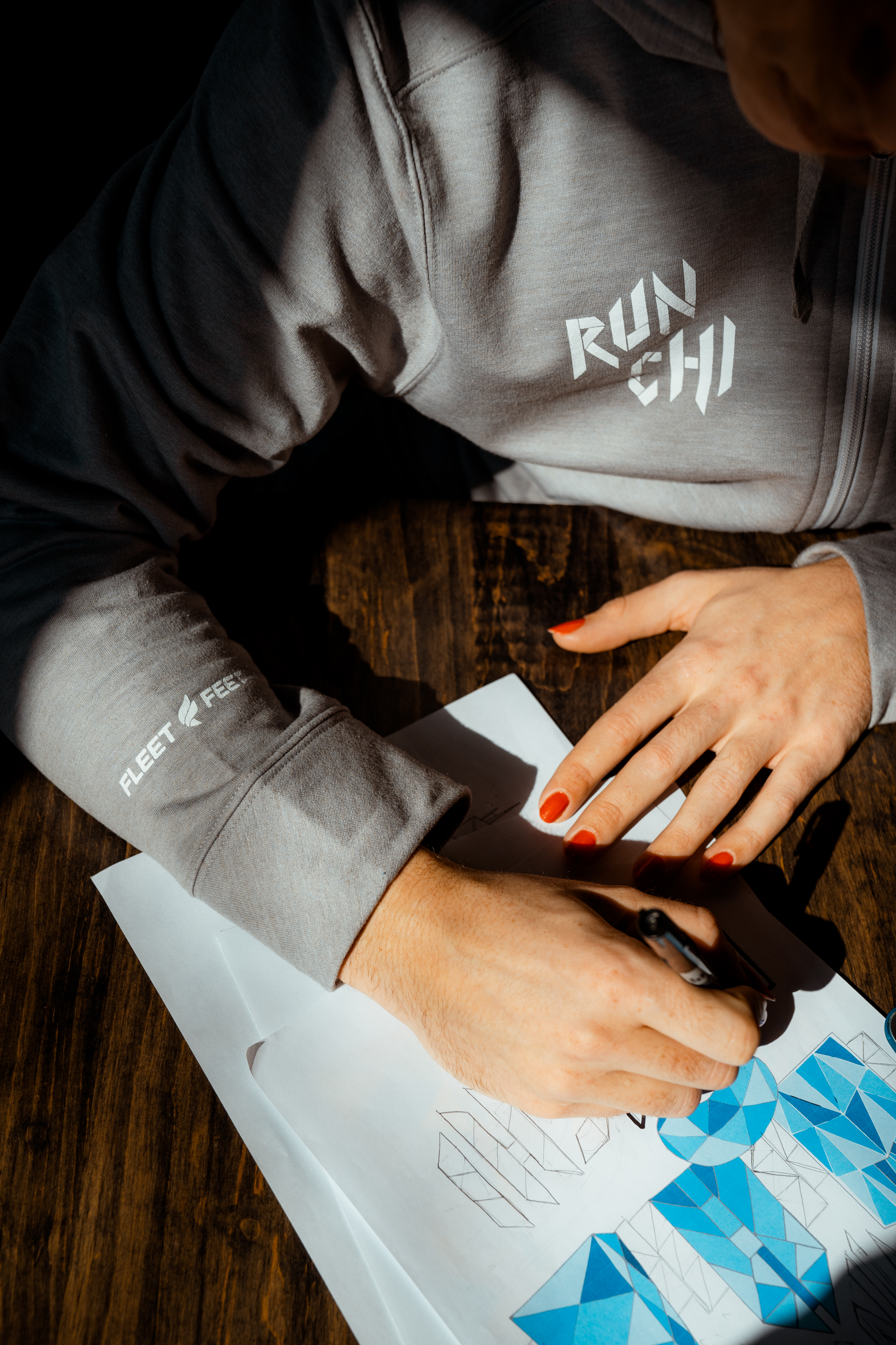
The Chicago skyline is pretty much Chicago’s iconography. So I was like, “how do you reinvent this?” Each building is unique and tells a different story of Chicago’s history and they survive the harshness of the winter’s and thrive in the wonders of the summertime, just like us. Every time we see the skyline, whether covered in ice or reflecting the bright summer sun, our skyline is always changing and always radiant. Some people will look at this design and see the skyline they know and love, but some people might see the melting triangles of snow or the dazzling shards of sunlight.
I think the geometric design is especially interesting in the bean, because The Bean is round and contoured. There are no hard edges. I like the contrast between the shape of the bean and geometric shapes used.
It's funny. I actually looked at a photo of the snow melting on top of The Bean and it actually kind of formed those cracks as it fell down the side. That one was actually a literal interpretation.
How do you get into the design mindset?
I love sitting in a coffee shop and just being around the crowd of people and sipping a coffee and just going with it.
What tools did you use, from sketch to digital?
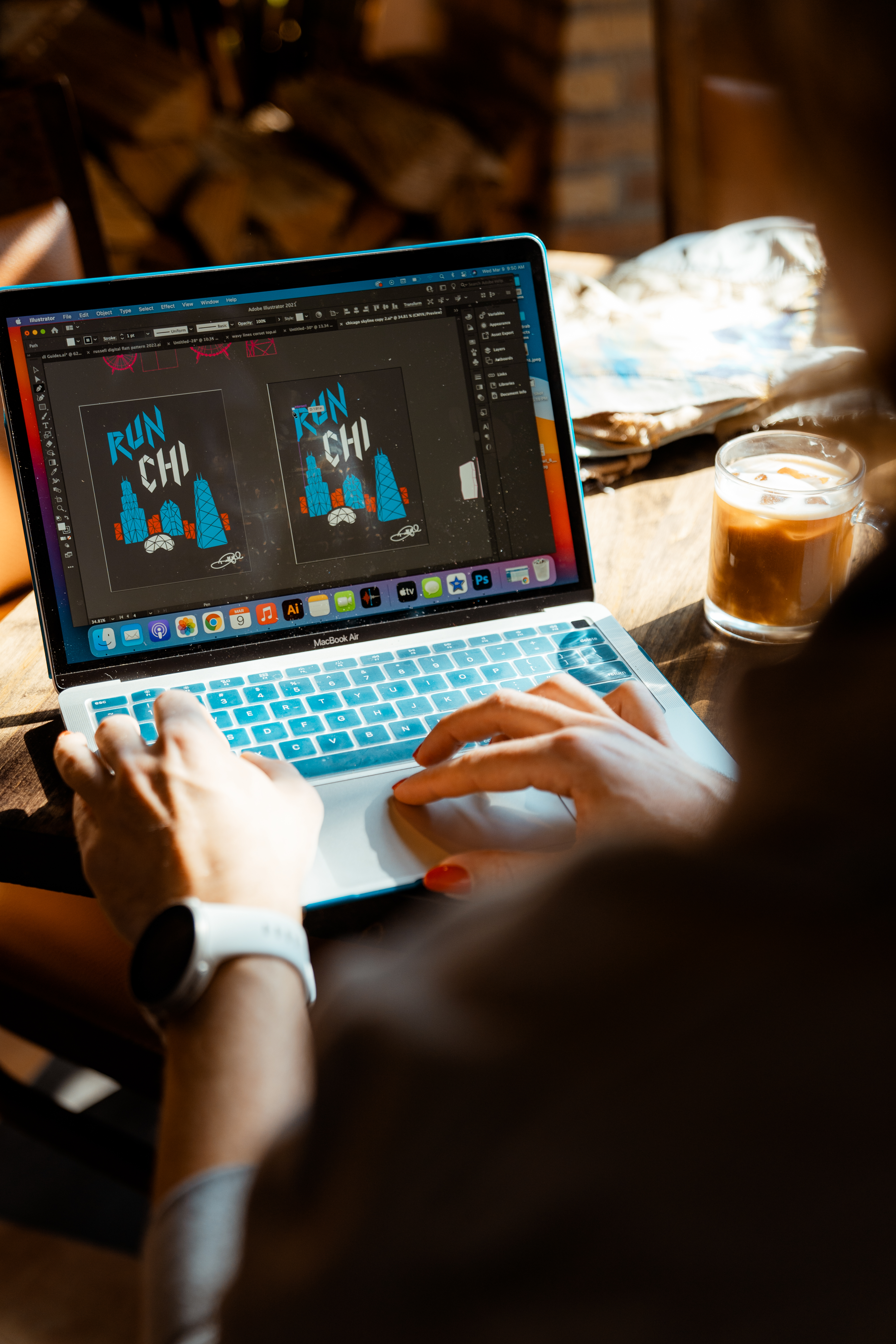
I used pencil and ink for the original drawings and used a scanner to convert it to a digital format then I used Adobe Illustrator to clean it all up using the pen tool.
How did this opportunity arise?
What’s so cool about Fleet Feet is that they are all locally owned and operated. I was actually working with the head of apparel buying and she found out I was a graphic designer and that I had done some t-shirts in the past. She asked me what I would want to design and didn't give me any stipulations. I didn’t really realize that Fleet Feet would do something so local and support an artist in this way and I was like, “oh my God, this is real. Let's get the designs out.”
Connect With Us
See the latest from Fleet Feet Chicago